Showing posts with label before and after. Show all posts

Thursday, October 12, 2017

A few more Sun Room Updates

We’ve done quite a bit of work in the sun room over the last few months - nothing amazing or particularly hard - but it really has come a long way and I wanted to show you how this little extension of living space has evolved since we moved in.

When I blogged about replacing our windows you may have noticed in the after photos that we added curtains. I say windows but really...our “windows” aren’t actually windows - they’re sliding doors.

Sometimes...ok – most the time – sliding doors aren’t great looking. Often times they're old, aluminum, yellowed, rickety, or they make a lot of noise every time you open and close them, and everyone would really like to have french doors instead. Right? It's what you see all over those home décor magazines and design shows - big beautiful windows that let in tons of natural light or French doors left wide open, leading you out into a perfectly manicured backyard. #housegoals

But sometimes you live in an apartment (we have) or sometimes, like in our case, French doors just aren't in the budget (it wasn't) and those #housegoals just isn't your reality. So you opt for the budget friendly option and install sliding doors.

We did and they ain't all that bad now, are they?


Remember in this post where I told you that the quotes we received ranged anywhere from 8k to over 30k? I remember being about 4 months pregnant and gasping when the rep quoted us 30k to replace our sliding doors with all-wood french doors. Triple what vinyl sliding doors cost us!!! We promptly told him thank you but hell no - we have kids to feed.

As you already know, we went with the sliding doors but here's how I make them look like we paid 30k without actually having to:
  • If installing new - go white. We had to have a different color on the outside per our HOA requirements so we paid a little extra to have the frames white on the inside. The white will draw the eye away from the window itself and allow you to focus on the view beyond. It'll also make the area look and feel larger. I toyed around with the idea of black frames because it's super on trend right now to have black framed windows against stark white walls, but unless you're dealing with actual windows or French doors, white is your best bet.
  • Always add curtains! Throw a curtain rod above your sliders just like you would a window and I promise, you'll be happy you did. Just remember to hang your curtains high and wide! I did this in our last apartment - even with the vertical blinds that were already there - and it made such a huge difference. Here's an old picture I dug up to show you:
 
It took a little while to get around to adding curtains to the sun room mainly because our configuration is a bit odd.
Our sliders go floor to ceiling (there's no wall space to install a traditional rod above the slider) and then we have a beam running between each set of sliders. In addition to the tricky configuration, each set of sliders are 96" wide which made finding a long enough rod that wasn't $$$ even more difficult.
I ended up going with this Ikea rod and these wall mounts that we attached directly to the beams but for those lucky people who have normal sliders in a normal configuration, any curtain rod will work! We used the Ritva curtains also from Ikea to save on cost and these curtain rings from Amazon. It was by far the cheapest way to go to dress this many "windows". Plus it can withstand my 8 month old trying to climb the curtains sooo there's that.

 
Aaaand for the easiest DIY ever...if you ever buy a pair of curtains that are too long, this no-sew hem tape is MAGIC! I literally just hung the curtains up and trimmed off the excess fabric while they were still up and then used the hem tape to finish them off for a clean hem line.
A few other updates we made in this space:
The water damaged drywall by the laundry room got patched:

The entire room got a fresh coat of bright white paint - Super White by Sherwin Williams and the yellowed recessed lights all got sprayed white too - Rustoleum White in a Matte finish:

The laundry room and master bedroom doors both went darker - Tricorn by Sherwin Williams:


Here's a before and after side by side looking towards the master bedroom:

And looking down the other direction:


Still to come: adding a long runner (probably FLOR tiles) and I'm tossing around the idea of planking the ceiling and wood wrapping the beams.
There's always more work to be done it seems...


Friday, May 19, 2017

A Sweet Nursery | The Reveal

Wow!! It's been a while hasn't it? Did you miss me?

You might remember that the nursery was part of our 2017 House Goals list for obvious reasons so today...I'm really excited to share the room we made over for the newest member of our family.

Our sweet baby Emie arrived into this world quite clumsily on February 3rd (after being an unbearable 2 weeks late) + after a few delivery complications + a lot of figuring this parenting thing out (which I'm still doing), I finally had a few spare moments to throw a few words + pictures together to create this post for you. I hope you enjoy!

But before we dive right into the nursery reveal...let's see the before:


The previous owners used this room as an office which is how the room was staged to sell and + why there are no doors in that huge opening (which leads to the sunroom) in the 2 photos directly above. We eventually want to add french doors to this opening but for now it offers super quick access to the nursery for those never ending diaper changes without the hassle of having to open and close doors all day long.

Like a couple tornadoes, we stripped the room down to the bare bones. We removed the gross carpet, installed new laminate flooring, removed the dinky baseboard + trim in favor of substantial molding all throughout. I even removed the mirrored bypass closet doors + sold them on Craigslist because I have an odd aversion to mirrored doors.


What once was a boring all shades of beige room is now a room dedicated to the squishiest baby ever! Take a little look-see...


I wanted the room to be light + bright which is why I stuck with a mainly black + white color palette but added in touches of blush + gold. If you've seen the rest of my house, you know I'm a neutral loving gal plus the fact that babies can see in black + white, only made the decision easier.


If you saw on my Instagram stories a while back you already know that I was planning to wallpaper the crib wall. Well...I didn't. Not only was it going to be super expensive - I was never able to commit. 

I still would like to do something here but for now, I'm loving how fresh it feels!

On the floor I used a neutral black + gray braided rug that I already had on hand + layered over top the fluffiest white shag rug ever! Toss a couple throw pillows on the floor and even this old lady can get down on the ground + play with our babe! 

Plus the white shag rug, is perfect for our monthly photo shoots! Bonus! 


To the left of the crib is Emie's closet which we painted black + reconfigured. It still has a ways to go so this is all you'll see of it today. Oh...+ I definitely decided that I want to put doors back ON the closet. Just not mirrored ones 😁.

I totally thought I could be all cool + hipster living without closet doors but NO! My OCD got the best of me + I'm dying a slow death having to look at the contents of her closet every.single.day.


Directly across from the crib is the glider + dresser / changing table. This side of the room was by far the hardest to pull together because it had to serve so many purposes - a place to nurse, diaper, + house all those itty bitty baby essentials. 

After living + using this side of the room for almost 4 months, it's safe to say that we'll be making some tweaks in the future to make it work better for us. Until then - I want you to see it how it is today! 


The basket on the dresser corrals all our diapering essentials within quick reach (because when poo is involved - you need to be quick!) + the shelf above holds other often used items like cotton swabs + q-tips. Plus it gives us an area to show off her ever-growing shoe collection! Like those darling moto-booties Daddy bought her 😍.


How about a little side-by-side action?


Much better, right?!

If you love our nursery as much as I do - check back next week for all the sources! 

Now off to feed the turkey...

Thursday, December 3, 2015

The Entryway Re-do

The entryway in our apartment can hardly be called an entryway. It’s a 4’x3’ pint-sized speck of space that really has been useless…until now! Despite its small footprint, the functionality of this space really needed to pack a punch. An entryway in a home is probably one of the hardest working spaces a home can have. It’s the first space we encounter when we walk through the door and the place we unload our junk – think hats, jackets, bags, keys – just to name a few.

The problem with our entryway or lack thereof, is the tight spacing. The swing path of the front door is essentially all we have to work with. That’s it folks. We tried a few different options (as seen below) and even mocked some up in the past but none ever seemed to fit the bill when it came to functionality.


This shelf situation lasted the longest but probably only out of laziness or from being stumped as to how to solve the problem. Then one day I was just so fed up with it and took everything off the wall. As with most projects – starting with a blank slate is really the first step. It pushes the reset button on the space and allows my brain to reset too in terms of design. Without the distraction of “stuff” I hate staring back at me, I can start brainstorming on a solution that I’ll love in the end.

I patched all the holes and gave the wall a fresh coat of paint. Then I made a list of the issues.

Clutter was the #1 issue and biggest driving force behind the entryway re-do.  What I learned from the last time around that I tackled this space is that we’re not a family that can handle “open shelving”. Some are, some aren’t. We are definitely in the AREN’T category. Unless I constantly policed or tidied up the shelf, it was a constant catch all for “stuff”…receipts, business cards, candy and/or candy wrappers, change, pens, pencils…etc. It was a nightmare.

The 2nd biggest issue was ease of convenience. Over time I’ve found that unless it’s easy, kids and ahem…grown men, won’t use it. It was amazing to me how many times I found jackets strewn all over the house – on the couch, backs of chairs, on the floor (!!!!), when our coat closet was literally an arm’s reach away! Apparently small kids and grown men have trouble opening doors and reaching for a hanger to hang up their coats.

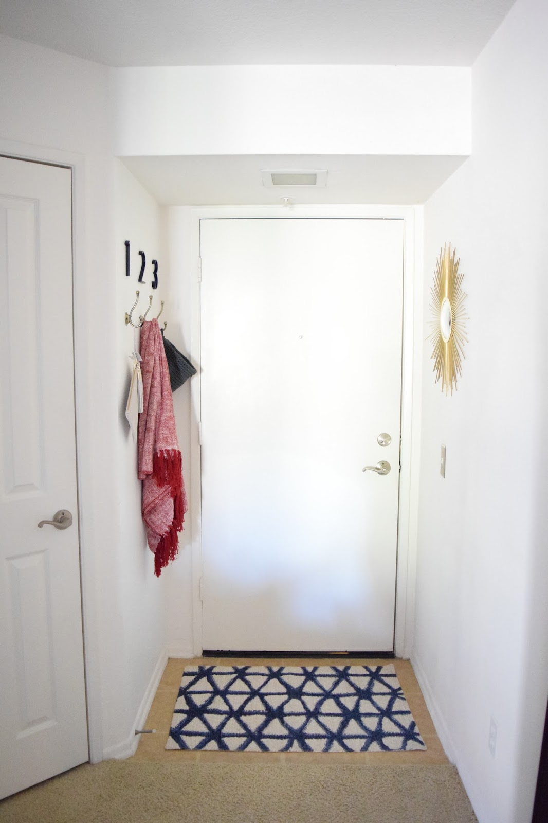
With all my issues written down, I set about to solve them once and for all and give our tiny entryway a whole lot of functionality too. What I ended up with is hooks and baskets. No more open shelves! I determined that clutter will always be but I can handle the clutter so long as I don’t have to see it J. Below is the end result – ain't she pretty?


I installed a set of 3 hooks that people of all ages can use with ease – no more hassling with hanging our coats in the coat closet. For whatever reason, hooks are so much easier for kids and even grown men to use. The thought! We still keep additional coats in the nearby closet but for the ones we use more often, these hooks have been a saving grace. They’ll come in handy too for guests who need a quick and easy spot to store their coats while they’re visiting without having to ask where to put it. Using the hooks in our entryway have worked so well that I’m thinking of using them in the bathrooms too instead of towel bars – another things certain people in our household have trouble using!


To tackle all the other clutter that seems to accumulate at the front door, I hung up a woven basket that I picked up from the bath section at Ikea to corral wallets, receipts, cards, loose change – all of the above! As I said before…as long as I don’t see it, I can deal with it. The basket conceals the mess and is big enough to hold every day essentials like wallets and keys. I still keep my keys inside our coat closet with my purse, but for my guy who likes to empty his pockets at the door, this has been a perfect solution for him. When it starts getting out of hand, I can easily sort through the contents and purge what isn’t needed. What was once a daily battle is now something that only needs to be managed once a week. A win-win.


Once the issues had been addressed, it was time to add in some personality! My favorite part of any project. I added a couple of address numbers above the hooks because they were right next to the hook section at Lowes and I liked how modern and sleek they looked next to the almost aged look of the hooks. I painted the numbers a deep navy blue which ties in the brand new Target rug I found at Goodwill (score!). Goodwill is like Target’s clearance center in case you haven’t been lately.


The sunburst mirror added to the opposite wall lets us ladies (or guys too) do a last minute quick look when we’re headed out the door and it’s gold color coordinates with the aged hooks on the opposite wall.


Here's a look at the new entry in relation to the coat closet that I organized almost a year ago. The systems I installed nearly a year ago are still working well for our family so now with the functionality of both these spaces give us no room to make excuses!


Making these small changes has really added so much value to this tiny space and allowed it to really work for our family. Living in such tight quarters makes every bit of real estate so valuable and when it can function the way our entryway functions now it makes the time and money spent very well worth it.

Thursday, November 5, 2015

Plant Pots and Paint Pens

Say that 10x fast!

As I mentioned at the end of this post, I’m slowly trying to ease my way back into the blog and chip away at all those projects we put on the back burner for a bit. While we’re still knee deep in the raw every day emotions of this new life we’re adjusting to, staying busy helps.

Outside of this blog I work a regular ol’ 9-5 except instead of 5 – 8 hour days, I work 4 – 10 hour days with every Monday off. Having Mondays off is great! While everyone else in the world is at work, I’m able to accomplish a whole lot of blog related stuff and tackle a few projects around the house unless I turn on the TV and get sucked into a Gilmore Girls marathon – then all productivity goes out the window. Over the last few months, that sorta became the norm as I wasn’t very mobile towards the end but I’m slowly redirecting my focus and I have to say that it feels good.

This last Monday was a very productive one after many, many unproductive ones. I worked on and/or completed 5 new projects – all of which I’ll be sharing here sooner or later. High fives for me!

This first one is more so a facelift than it is a project and takes zero skills whatsoever. One of the things I love most about decorating is incorporating live plants into every room. I think plants just brighten up the space and when you add any sort of natural element it just brings the room to life. Unfortunately for me, I totally suck at keeping anything alive. That’s why I always tend to gravitate towards low maintenance plants – usually of the succulent variety. But even I’ve managed to kill quite a few of those too. Most recently I killed a snake plant…or most of it…which is considered to be virtually indestructible. #GOme. I think I have a chronic case of over-watering but I’m working on it.

I woke up one morning to find that 95% of my snake plant was water logged and the stalks were falling over, so after feeling like such a failure, I removed the dying stalks and was left with a whopping 3 stalks. Sure made for a wimpy plant. So while I’m trying to bring it back to life, I went to Home Depot and brought home my next victim and plopped it in the pot that the previous one vacated.

Except the pot totally sucks. Just like my plant caring abilities. It was just a plain white ceramic pot I picked up from Ikea and thought that maybe…just maybe…if I jazzed up the pot a bit the plant would last longer. #Ainthappening. But I went ahead and did it anyways because that’s how my crazy mind works. I could use all the help I can get.


The ceramic pot already had some raised detailing so I just took a paint pen and enhanced the details. Looks like a totally different pot – and much more expensive too might I add! Don’t you agree?


Here's a side by side:


And the best part? You don’t have to have these pots with raised details from Ikea to achieve the same look. Any plain ceramic, or terra cotta pot too for that matter, can be transformed with a paint pen and free-handing a super simple pattern…think dots, crosshatch, grids – the options are endless!

So what do you say? Think this super cute pot will help keep my plant alive? Probably not but #Onecanhope.

Wednesday, July 1, 2015

Living Room Changes - Part 2

Last time I checked in I showed you guys the beginning stages of some small changes that we've been making in our living room over the past few weeks and today I'm back to show you what else we've been up to.
 
The next set of changes we recently made involves a part of our living room the blog hasn't even seen yet - our media wall. Decorating your home to accommodate that uber important TV is often challenging, and in our case, was only made worse when we purchased a larger, more obnoxious television to replace our old, on the edge of death, TV. After purchasing the larger TV, we were forced to do some furniture musical chairs when it became clear that the wall that used to house the TV, was way too small.
 
The previous media wall, as seen in this really bad cell phone pic, shows just how cramped the previous situation was to begin with. The TV and media cabinet were smashed up against the curtains and sliding glass door leading out to our patio leaving no extra room to accommodate a larger TV.
 
 
So...with a new TV and the realization that the existing wall was too small, we did some rearranging and moved the TV, the media cabinet, and Anthony (the antelope) to an adjacent wall with a really annoying nook that I've hated since the day we moved in but since it was the only other place for the new TV, we had to make it work.
 
The nook is off center on this wall and for a person that really gravitates towards symmetry, it's always been a nightmare for me to decorate around. This little nook has seen quite a few changes in the 2 years that's we've lived here which I plan to document in a future post, but this go-around in the nook is by far my favorite.
 
 
After moving everything over into the nook, the entire wall felt visually heavy on the left and really empty on the right, making the nook all that more prominent and irritating!
 
I didn't have much space to work with on the left but I knew that it definitely needed something to visually balance everything out and with all the craziness going on to the left, I thought something clean and symmetrical would be the best solution to both my problems.
 
I decided to do a gallery wall of frames filled with pictures from some of our most memorable travel adventures. The inspiration for this came directly from these two awesome bloggers as seen on their sites here and here.
 
Ready to see how it all came together?
 
 
For the gallery wall I chose to go with these warm wood toned frames that I scooped up at Ikea. I've been on a mission to bring in some wood tones and textures into our home to warm things up a bit and balance out our other black furniture pieces and I think these frames did just that!
 
 
I chose vacation photos that were bright, bold, and full of vibrant colors! It's the perfect way to display our personal memories in a very subtle way while bringing in some fun colors at the same time.
 
To put my own little spin on our travel adventures gallery wall, I used my all time favorite (but sadly discontinued) Martha Stewart bookplate labels on the glass of each frame to name the travel destination pictured. Great thing about this is no matter what picture you showcase, the label can always be updated easily as you add more destinations to your passport! And for those with a short term memory, you'll always have a handy reminder of where your photo was taken!
 
 
To hang the pictures, I used every renters BFF - 3M Command Strips (you can see the little bump out of the Command Strip on the top of each frame in the photo below). Using 3M Command Strips saved me from putting 16+ nail holes in the wall and from having to patch all those holes when we leave. Plus, 3M Command Strips are re-positionable and made it easy to make sure my grid lines were nice and straight. Can't beat that!
 
 
All in all, for all the challenges this wall & the larger TV presented us with, I'd say I'm smitten with the results! Plus I think Anthony is enjoying the new scenery too...
 
 
There's still one more change I'm working on to round out our living room refresh, be sure to check back soon so you don't miss out!